Any information contained on this Website is not legal advice and should not be treated as such. You should always contact an attorney for help with your specific legal needs and issues. We may also earn a commission when you click links to our partners and purchase goods or services. For more information, read our Disclaimers Policy.
Why Responsive Design is Essential for Modern Websites
Webflow responsive design helps you create websites that work perfectly on any device, from desktops to smartphones. Here's a quick guide:
Quick Implementation Guide:
- Start with desktop design - Create your base layout first
- Use Webflow's breakpoints - Adjust for tablet and mobile views
- Apply fluid grids and flexible images - Let content adapt automatically
- Test across devices - Use preview mode and real devices
- Optimize for mobile-first - Design for smallest screens, then scale up
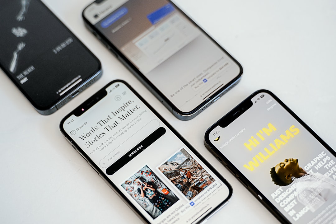
With over 60% of all web traffic coming from mobile devices, your site must adapt to different screen sizes, or you risk losing visitors. Responsive design is about creating an optimal user experience on any device. When done right, it improves SEO rankings, reduces bounce rates, and increases conversions.
Webflow makes this process visual and intuitive. Instead of writing complex CSS, you can visually adjust layouts and see real-time changes. The platform handles the technical side, letting you focus on the user experience. This means faster updates, better collaboration, and the power to make changes without developer delays.

Webflow responsive design vocabulary:
Why Mastering Webflow Responsive Design is Non-Negotiable
Imagine losing a customer because they couldn't steer your site on their phone. If users have to pinch, zoom, and scroll horizontally, they'll leave. This happens daily when websites aren't responsive. With more than 60% of web traffic now comes from mobile devices, mastering Webflow responsive design is essential for business success.
Google prioritizes mobile-friendly websites in search results. A non-responsive site ranks lower, reducing organic traffic. Mobile-friendliness directly impacts your SEO performance and is a crucial ranking factor.
Beyond SEO, a better user experience is key. When visitors can easily steer your site on any device, they stay longer. This improved experience leads to higher conversion rates, as a professional, easy-to-use site encourages users to complete actions and builds trust.
Future-proofing is another benefit. A responsive site adapts to new devices like foldable phones and larger tablets without needing separate mobile or desktop versions. It also helps reduce bounce rates; when a site works on any device, visitors are less likely to leave immediately.
At Matthew John Design, we see how responsive Webflow sites empower marketing teams. A website that works beautifully on every device gives your business the best chance to connect with customers everywhere.
Understanding the Pillars of Responsive Design
Responsive design is like water—it adapts to fit any container. We want our websites to do the same, seamlessly adjusting to every device. Webflow responsive design is built on key pillars that create this fluid experience.

Fluid grids are the backbone. A fixed 500-pixel box won't fit on a 300-pixel screen, forcing horizontal scrolling. Fluid grids solve this by using flexible proportions instead of rigid measurements. Instead of a fixed width, a sidebar might be set to 25% of the available space, allowing it to adapt gracefully.
The key is using relative units over absolute units. Absolute units like pixels (px) are rigid, while relative units are flexible:
- Percentages (%) size elements relative to their parent container.
- Viewport units (VW and VH) are relative to the browser window (1vw = 1% of viewport width). They are perfect for full-screen hero sections.
- REM and EM units are for typography. REMs are relative to the root font size, and EMs are relative to the parent's font size, ensuring harmonious scaling.
Reflowing content is the automatic result of using flexible units. Text wraps, images resize, and layouts adapt, making the experience feel natural. Flexible images and media scale down to fit their containers, preventing them from overflowing on small screens.
The mobile-first approach ties this together. It means designing for the smallest screen first, which prioritizes core content for mobile users, with improvements added for larger screens. Since most traffic is mobile, this ensures a solid experience for the majority.
These pillars work seamlessly in Webflow, allowing you to see responsive changes in real-time. The platform handles the technical side, giving you full design control.
A Practical Guide to Building Responsive Layouts in Webflow
With the principles covered, let's get practical. Webflow responsive design shines by making complex CSS concepts visual and intuitive. Webflow is a visual playground where you can see real-time changes. Adjust elements visually and watch them adapt instantly across screen sizes without wrestling with code.
This visual approach empowers marketing teams to build scalable sites with reusable components and templates, launching campaigns without developer delays. You can create an easy-to-use drag-and-drop system with Webflow components and page building, making complex layouts accessible to non-technical team members.
Mastering Breakpoints for Different Devices

Breakpoints are checkpoints where you adjust your design for specific device sizes.
In Webflow, you start with the Desktop breakpoint. Styles cascade down to smaller devices, so you aren't starting from scratch for each view. Default breakpoints cover common devices: Desktop (992px+), Tablet (768-991px), Mobile Landscape (479-767px), and Mobile Portrait (320-478px).
Changes made at a smaller breakpoint only affect that view and smaller ones, protecting your desktop layout. For unique requirements like large monitors, Webflow allows custom breakpoints, ensuring your design looks perfect on any screen. For a deeper dive, see Webflow's Introduction to breakpoints in Webflow.
Using Flexbox and Grid for Ultimate Control

Breakpoints define when a layout changes; Flexbox and Grid define how. Webflow's visual interface makes these powerful tools easy to use.
Flexbox is for one-dimensional layouts (rows or columns). It's perfect for centering items, distributing navigation links, or reordering elements for mobile without changing the HTML. A navigation menu is a great example: horizontal on desktop, stacked vertically on mobile. Experiment with Webflow's interactive flexbox builder to learn more.
Grid is for two-dimensional layouts with rows and columns, like a magazine. It's ideal for overall page structure and complex sections where horizontal and vertical alignment matter.
Combine Grid for the main page structure and Flexbox for content within sections. This gives you ultimate, intuitive control over your layout and is the foundation for building with reusable components.
Optimizing Images and Typography
A great layout is useless if images load slowly or text is unreadable. Webflow automatically optimizes images, creating multiple variants upon upload. It serves the appropriate size to each user—smaller for phones, high-res for 4K monitors—ensuring fast load times. However, you should still compress images before uploading to give Webflow a better base to work from.
For video content, Webflow only supports background videos up to 30 MB and does not provide native hosting for larger video files. For videos exceeding this limit, use third-party solutions like YouTube, Vimeo, or Vidzflow.
Typography requires a thoughtful approach. Use relative units like rem instead of fixed pixels, so text scales with your base font size. Set a base font size on the HTML element and use rems for everything else. Adjusting the base size at different breakpoints scales all your text proportionally.
Readability is key. Use a line height of 1.4-1.6 and keep line length to 50-75 characters. Also, avoid text widows—single words on their own line. Learn more in our guide on how to prevent text widows. These details ensure your Webflow responsive design is not just functional but also beautiful and readable.
Best Practices and Common Pitfalls
Mastering Webflow responsive design takes practice. The difference between a good and a great responsive site is in the details that lift the user experience.
Key Best Practices for Webflow Responsive Design
- Mobile-first design strategy: This practical philosophy saves time. Designing for the smallest screen forces you to prioritize essential content, leading to cleaner designs.
- Optimize mobile navigation: A desktop menu won't work on a phone. Use a hamburger menu, but ensure it's easy to use with clearly labeled, tappable links.
- Use generous touch targets: Aim for at least 44x44 pixels. This prevents user frustration when tapping buttons on a phone.
- Focus on performance: A slow site is useless. Optimize images, use Webflow's CDN, and avoid unnecessary widgets.
- Accept negative space: White space improves readability and gives your design room to breathe, especially on small screens.
- Plan your content structure: Before designing, decide what's essential on mobile, what can be hidden, and how content will adapt.
- Integrate accessibility: Use high contrast, alt text, and ensure keyboard navigation and large interactive elements. This is inclusive, broadens your audience, and can boost SEO, aligning with the 5 elements of user experience.
Common Mistakes to Avoid
- Forgetting to check all breakpoints: Test your design on desktop, tablet, and both mobile orientations. Each view represents real users.
- Using fixed pixel widths for containers: This breaks responsiveness. Use relative units (%, vw, fr) for containers that need to adapt.
- Overloading mobile views: Mobile users have different goals and less patience. Prioritize essential content and hide the rest.
- Poorly optimized images: Even with Webflow's variants, starting with a huge file will slow your site down.
- Neglecting landscape mobile view: Always test this view, as users often rotate their phones. Webflow provides a specific breakpoint for it.
- Over-relying on custom code: Webflow's visual tools are powerful enough for most responsive adjustments.
Testing and Refining Your Webflow Responsive Design
A responsive site is never finished. Testing and refinement must be part of your workflow.
- Webflow's preview mode is a great first step for checking different device views in the Designer.
- Real device testing is irreplaceable. Test on actual smartphones and tablets (both iOS and Android) to find issues simulators miss.
- Browser developer tools let you emulate various screen sizes and simulate slow networks to understand performance for all users.
- Gather user feedback for the most valuable insights. Watch real people use your site to reveal issues you've missed.
Responsive design is iterative. For comprehensive testing and optimization, consider professional quality assurance services to ensure your site remains excellent.
Frequently Asked Questions about Webflow Responsive Design
Here are answers to common questions about Webflow responsive design.
How does Webflow handle responsive images automatically?
When you upload an image, Webflow automatically creates multiple scaled-down versions. It then serves the most appropriate image size based on the user's device and resolution. A mobile user gets a small, fast-loading version, while a desktop user gets the full-sized image, all without manual work.
The result? Faster page loads and a better user experience. Mobile users avoid large downloads, and desktop users see sharp visuals, saving you time and boosting performance.
Can I create a layout for large monitors in Webflow?
Yes. Webflow includes a default breakpoint at 1280px and allows larger custom breakpoints. This lets you create layouts that take advantage of extra screen real estate on large monitors, ultrawide displays, and TVs, ensuring your design looks polished and intentional.
What is the difference between using percentages (%) and viewport units (VW/VH)?
Percentages (%) size an element relative to its parent container. A div with 50% width will always take up half of its container's width.
Viewport units (VW and VH) size an element relative to the browser's viewport (the visible window area). 1vw is 1% of the viewport width, and 1vh is 1% of the viewport height.
Use percentages for elements relative to their container. Use viewport units for elements that should scale with the entire screen, like full-screen hero sections.
Conclusion
By mastering Webflow responsive design principles—from fluid grids to device optimization—you can now create websites that shine everywhere. Responsive design is about more than fitting screens; it's about creating natural, effortless experiences for every visitor. A site that adapts seamlessly shows respect for your users.
Webflow makes this process visual and intuitive. Its breakpoint system, Flexbox, and Grid let you design visually and see instant changes, turning a complex task into a creative one.
Fundamentally, responsive design puts users first. A mobile-first approach with optimized images and scalable typography creates experiences that work for everyone, building trust and improving conversions.
At Matthew John Design, we see how responsive design transforms a business's online presence. We build scalable Webflow sites with reusable components, templates, and CMS structures, empowering your marketing team to manage content and campaigns without developer delays.
Your website should work hard for every visitor on every device. If you're ready to build a responsive site that drives real results, we can help. Get expert help with your SEO and content strategy and let's create an experience that delights your users.