Any information contained on this Website is not legal advice and should not be treated as such. You should always contact an attorney for help with your specific legal needs and issues. We may also earn a commission when you click links to our partners and purchase goods or services. For more information, read our Disclaimers Policy.
Introduction: What Are Webflow Components?
Webflow reusable components are like building blocks: groups of design elements you can save and reuse across your website.
They're powerful because they help you:
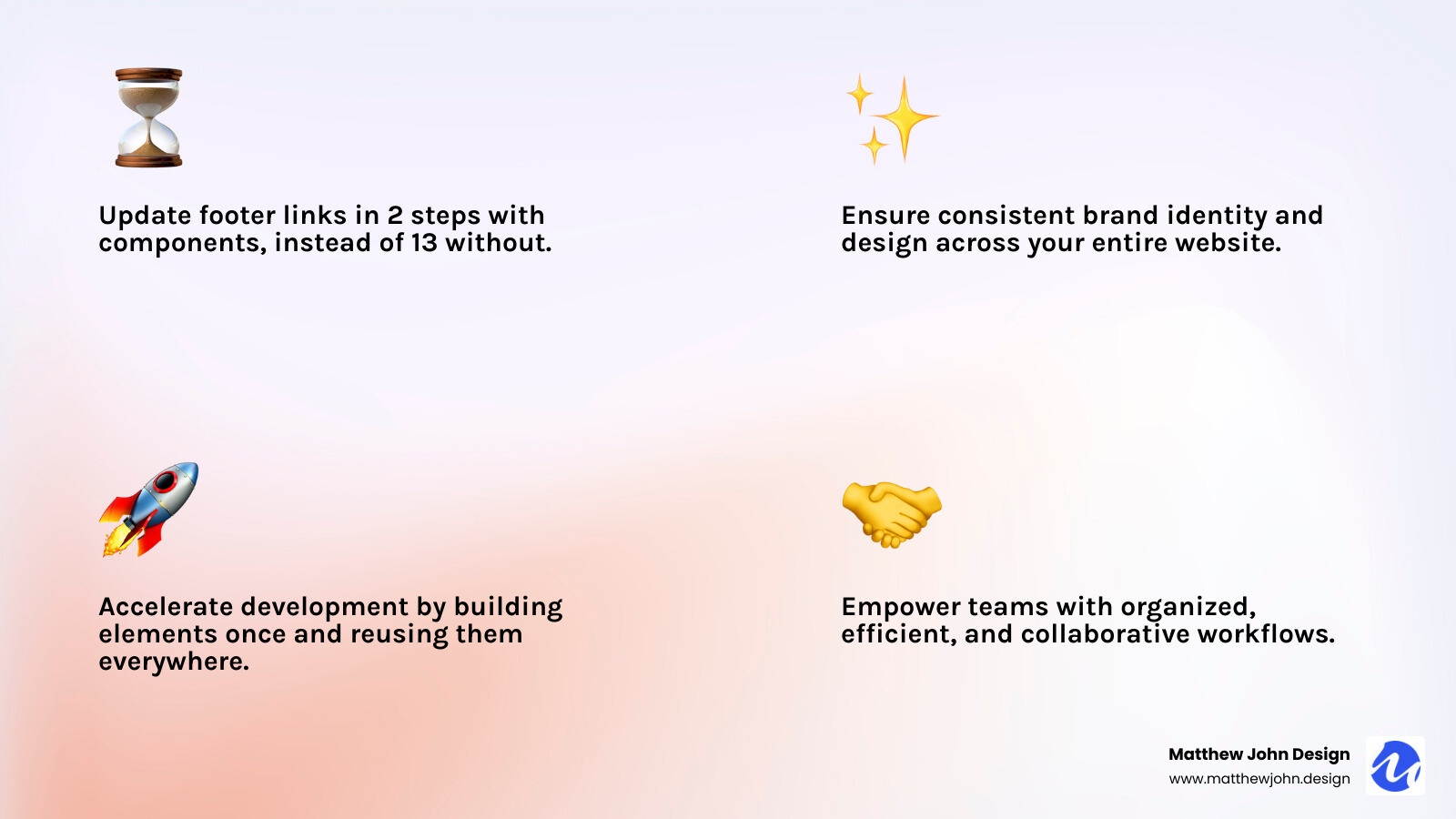
- Build Faster: Create a design element once and use it everywhere, eliminating the need to build from scratch each time.
- Stay Consistent: Maintain a consistent look across your site, keeping your brand strong and professional.
- Save Time: Updating a footer link on six pages takes 2 steps with components versus 13 without them—a huge time saver.
- Work Together Better: Help your team stay organized and efficient, making collaboration easy.
In web design, efficiency and consistency are key. Imagine updating your site's navigation bar—without components, you'd have to edit every page individually, which is time-consuming and prone to errors.
This is where Webflow's reusable components shine, simplifying complex projects and helping you build a strong, consistent online presence without the headache.

Webflow reusable components terms made easy:
The "Why": Opening up Efficiency and Consistency
At Matthew John Design, we know Webflow reusable components are essential for modern, manageable, and flexible websites. The core principle is simple: build once, use everywhere. This approach offers huge benefits, especially as your site grows.
Time-Saving and Faster Development
The most significant benefit of using components is the time you save. Imagine a Call to Action (CTA) section on multiple pages. Without components, changing the button color means editing every single page manually—a tedious and error-prone process.
With Webflow reusable components, you update the main element once, and the changes apply everywhere instantly. This "update once, apply everywhere" model lets your team build pages faster, make quicker changes, and deploy updates confidently.
Design Consistency and Brand Integrity
Your website is your brand's digital storefront, and design consistency is key to building trust. Components act as a "single source of truth" for design elements. When navbars, footers, or product cards are components, they look and act the same everywhere, ensuring brand integrity.
This is vital for large sites or teams, as it prevents "design drift"—where small, separate tweaks lead to inconsistencies. By using the same building blocks, your site remains cohesive and polished, offering a smooth user experience.
Scalability and Building a "Landing Page Engine"
As your business grows, so does your website. A small site can become a large platform, especially if you use landing pages for marketing. This is where the scalability of components truly shines.
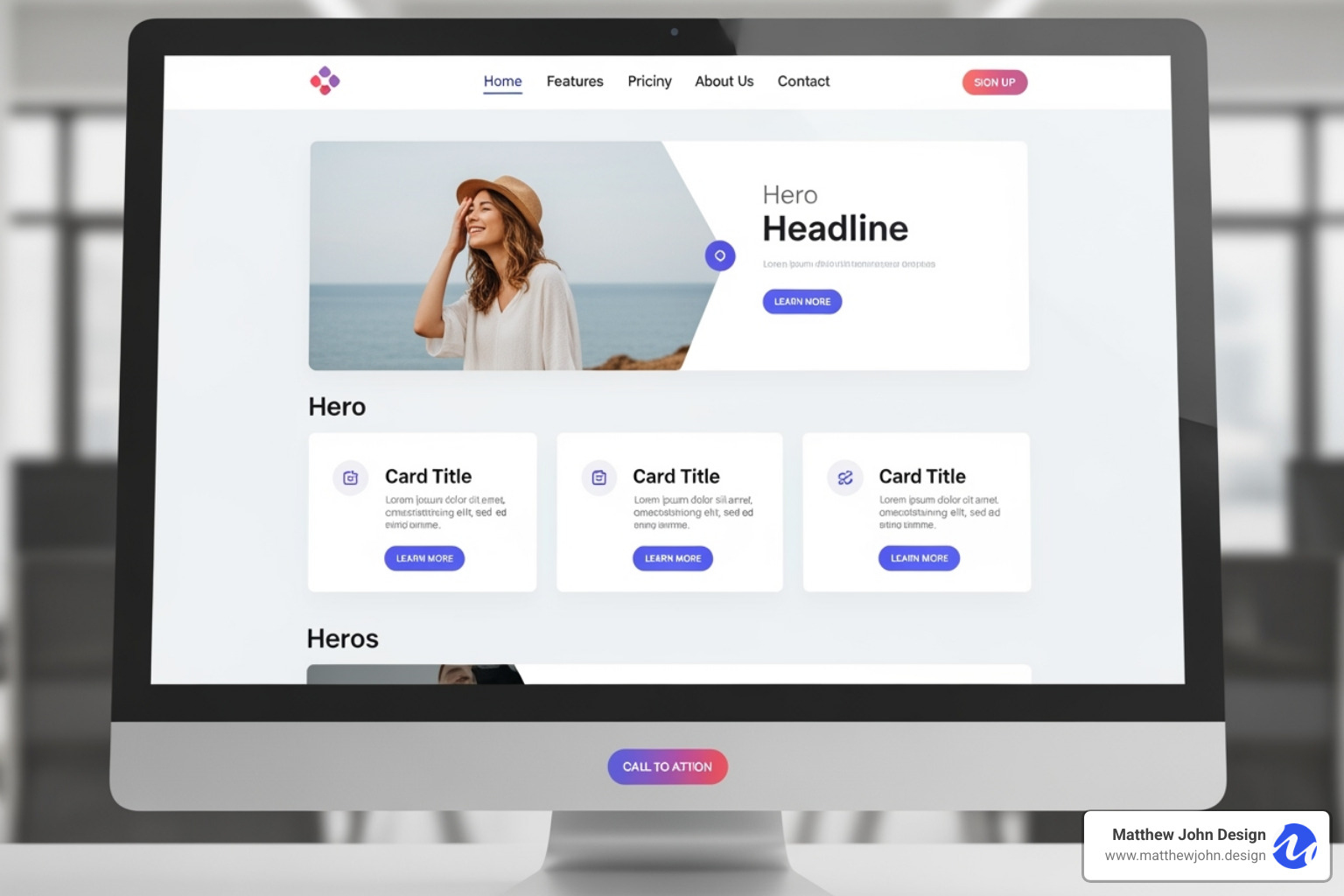
For instance, building a "landing page engine" is simple with components. Create a library of reusable sections like hero blocks, testimonials, or contact forms. Assembling a new landing page becomes a drag-and-drop process, allowing your team to create pages in minutes, not hours. This accelerates marketing efforts and drives results.
Team Collaboration and Empowering Marketing Teams
Components streamline team collaboration. A well-built component library empowers marketing teams and content creators to update content without deep design knowledge. This separation of duties allows designers to focus on the system while marketers confidently manage text, images, and links within those components.
At Matthew John Design, we build Webflow sites with these scalable, component-based systems, making them easy for internal marketing teams to use. This approach simplifies content creation, like blog posts and video summaries. For video, we recommend embedding from third-party solutions like YouTube, Vimeo, or Vidzflow, as Webflow's native hosting is limited to 30 MB background videos. This keeps your digital marketing efficient and organized.
Using Webflow reusable components isn't just about saving time; it's about building a more robust, flexible, and future-proof website. It's about working smarter to ensure your online presence is consistent, efficient, and ready to scale.

Want to dive deeper into why Webflow is the platform of choice for us? Check out our article on 11 Reasons to Use Webflow.
How to Create and Use Webflow Reusable Components
Understanding the "why" behind Webflow reusable components is key, but the "how" is surprisingly straightforward. Creating and using these building blocks will fundamentally change your workflow.
Step 1: Designing and Selecting Elements
First, design the element you want to reuse. Arrange elements like Div Blocks, Headings, Paragraphs, and Buttons in the Designer to create your desired layout.
For example, create a card with an image, title, description, and button. Once it's designed, select the main parent element that contains all these pieces, such as the wrapping Div Block. This parent element will become your component.
Step 2: Creating the Main Component
With your element group selected, it's time to create the component.
Find the "Create component" button: This icon is available in the right-hand sidebar, by right-clicking the element, or at the top of the Components panel.

Click the "Create component" icon.
- Give your component a clear, descriptive name like "Product Card" or "Main Navigation." This is crucial for organization as your project grows.
- Click "Create." Your element is now a "main component," indicated by a green outline and its appearance in the Components panel. This is your master copy.
Step 3: Using Component Instances
After creating the main component, you can reuse it across your site as "instances."
- Open the Components panel (puzzle piece icon).
- Find your component in the list.
- Click and drag the component onto any page or into the Navigator panel.
All instances are linked to the main component. Any change to the master copy automatically updates all instances, which is the core of their efficiency.
Step 4: Editing the Main Component
To make site-wide changes to a component, you must edit the "main" component. This is like updating a master blueprint; all copies update instantly.
- Enter editing mode by double-clicking an instance, right-clicking and choosing "Edit component," or clicking the green "pencil" or "wrench" icon.
- In editing mode, the canvas will dim and a green bar will appear at the top, indicating you're editing the main component.
- Make your changes, such as adjusting styles, layout, or content.
- Exit editing mode by clicking the "back" arrow, clicking outside the component, or pressing the Escape key.
Upon exiting, your changes will be reflected across all instances of the Webflow reusable component site-wide.
Step 5: Unlinking an Instance
If you need to make a unique change to a single instance without affecting the main component, you can "unlink" it.
- Right-click on any element within the component instance.
- Select "Unlink instance."
An unlinked instance becomes a regular group of elements, independent of the main component. It will no longer receive updates, and its changes won't affect other instances. Use this feature sparingly, as it breaks the connection that makes Webflow reusable components so powerful for consistency.
For a comprehensive dive into all component features, we highly recommend checking out the Components overview – Webflow Help Center.
Advanced Customization: Properties, Slots, and Variants
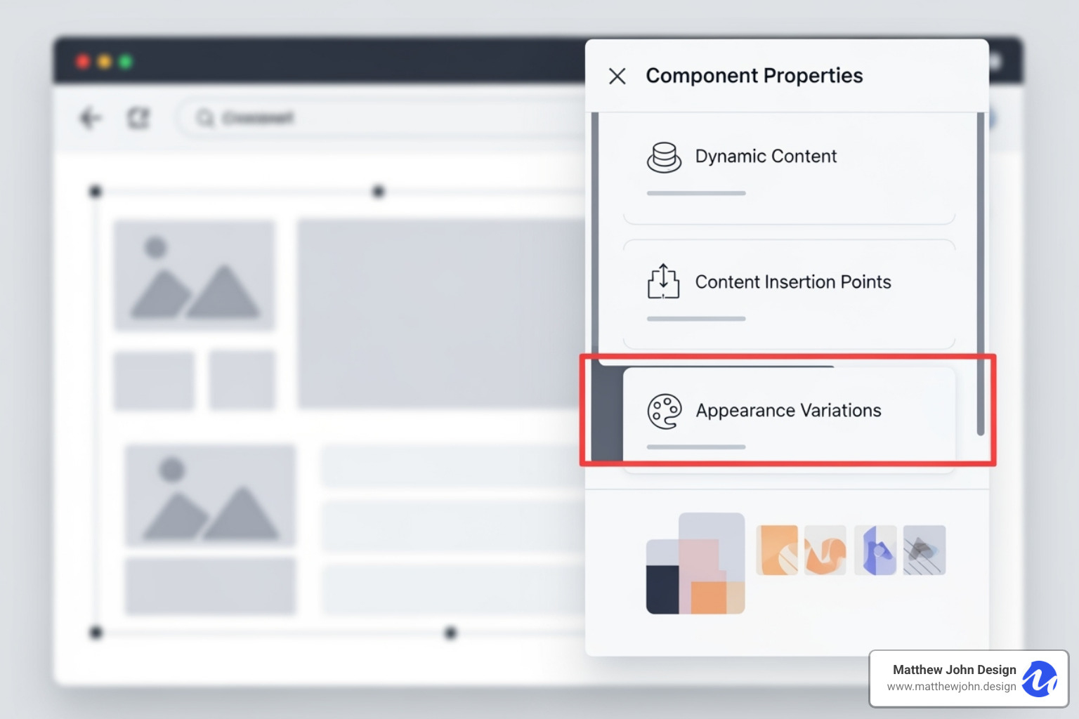
Beyond basic reusability, Webflow offers advanced tools for Webflow reusable components: properties (props), slots, and style variants. These are secret weapons for building flexible, manageable websites where components can be structurally consistent yet unique in content and appearance.

This is especially powerful for handling dynamic content and modular layouts without losing global control.
Customizing Content with Component Properties (Props)
Imagine building testimonial cards. The design is consistent, but the content (picture, name, quote) is unique for each. Component properties (props) solve this by making specific elements within a component editable on a per-instance basis. You can change text, images, or links for each card without altering the main component's design.
To set up a prop, enter the main component editing mode. Select the element you want to make editable (e.g., a heading or image). In the 'Element Settings' panel (gear icon), click the purple dot icon next to the setting you want to control (like 'Text' or 'Image'). Choose 'Create new property,' give it a descriptive name (e.g., 'Client Name'), select the content type, and click 'Create.'
You've now created a custom property. When you select an instance of this component, these properties will appear in the right sidebar, allowing you to customize the content for each instance without affecting the main design. This is a game-changer for content-heavy pages.
Building Modular Layouts with Slots
Slots act as placeholder areas within a component, allowing you to insert different content—including other components—into each instance. This enables highly modular and flexible page layouts.
To use a slot, enter the main component editing mode and drag a 'Slot' element from the Add panel into your component. You can also convert an existing Div Block into a slot. Then, exit the editing mode.
Now, when you use an instance of this component, you can select the slot and drag any element or another component into it. Each instance can hold unique content in its slot while the parent component's frame remains consistent.
For example, a 'Section Wrapper' component with consistent padding and a background could contain a slot. This allows you to drop different content blocks—like a 'Hero Section,' a 'Feature Grid,' or a 'Contact Form'—into the same wrapper, making it easy to build modular pages.
Creating Style Variants for Your Webflow Reusable Components
Style variants allow you to create multiple design options for a single component. For example, instead of creating separate components for 'solid' and 'outline' buttons, you can create one button component with two style variants.
To create a variant, enter the main component editing mode. In the 'Element Settings' panel, find the 'Component variants' section and click 'Add variant.' Rename the new variant (e.g., 'Outline'). While this variant is selected, apply unique styles to its elements, like setting a transparent background and a border for an outline button. You can add as many variants as you need.
To use a variant, select a component instance on your page and choose the desired style from the dropdown menu in the right sidebar. The component's look will change, but its content (set with props) will remain. You can also set a default variant for new instances.
Mastering props, slots, and style variants opens up the full potential of Webflow reusable components. This trio enables you to build adaptable components, making your workflow more efficient and your designs more consistent.
Best Practices for Managing and Scaling Your Components
Creating a few Webflow reusable components is easy, but building a robust, scalable system requires a strategic approach. At Matthew John Design, we focus on organization, smart integration, and easy sharing to ensure your component library is an asset, not a burden.
Organizing Your Component Library
A well-organized component library is crucial for findability, easy updates, and effective teamwork as your site grows.
First, establish clear naming conventions. Use descriptive names that indicate the component's function and style, like card-testimonial, btn-primary-solid, or nav-main. This simple practice saves time and prevents confusion.
Next, use folders to group related components in the Components panel. Create categories like "Navigation," "Cards," and "Forms" to keep your library organized and easy to steer.
Finally, for larger projects, create a style guide page within your Webflow site. This page should display every component with notes on its purpose, usage, properties, slots, and variants. It serves as a living document and a single source of truth for your design system.
Integrating Components with Webflow CMS
The true power of Webflow reusable components is open uped when connected to the Webflow Content Management System (CMS). This integration allows you to populate components with content directly from your CMS collections, creating a flexible and easily updatable site.
Component properties (props) can be connected directly to CMS fields. For a "Blog Post Card" component, you can link its "Title" prop to the "Name" field in your Blog Posts collection and its "Image" prop to the "Main Image" field. This automates content population.
For a blog, you can create components for the header, content blocks, and related posts. By linking these to the CMS, Webflow automatically builds new post pages when you add content to the collection. This creates a truly dynamic and scalable website.
To learn more about mastering your dynamic content, check out our guide on the Webflow Content Management System.
Sharing Components Across Sites with Libraries
For agencies or businesses managing multiple Webflow sites, sharing components across projects is a game-changer. Webflow's Libraries feature, available in Workspaces, makes this possible.
Webflow Libraries act as a central repository for your components. You can store your most-used components and pull them into any site within your Workspace, eliminating the need to rebuild them and saving significant time.
This feature is invaluable for maintaining brand consistency across projects, enforcing design standards, and accelerating development.
While we don't offer a drag-and-drop component builder for custom elements, our approach to Webflow Drag and Drop Components focuses on leveraging Webflow's native capabilities to create easy-to-use, reusable elements within the designer.
For a deeper dive into sharing, Webflow University has an excellent resource on Components - Webflow University.
By using these best practices, your Webflow reusable components will go from being simple building blocks to a powerful, organized, and scalable design system. This will make your entire web development process smoother, faster, and far more enjoyable!
Frequently Asked Questions about Webflow Components
Here are answers to common questions about Webflow reusable components.
How do you duplicate a component in Webflow?
Duplicating a Webflow reusable component can mean two different things, and it's important to know the distinction.
To duplicate a component instance on a page, simply select it and use copy-paste (Ctrl+C/Cmd+C and Ctrl+V/Cmd+V) or right-click and choose "Duplicate." This creates another instance that is still linked to the main component.
To duplicate the main component itself—for example, to create a new "Team Member Card" based on an existing "Testimonial Card" without linking them—you need a workaround, as there's no direct duplication button.
Here’s how you do it:
- Drag an instance of the component you want to copy onto your page.
- Right-click on that instance and choose "Unlink instance." This breaks the connection to the original main component.
- Select this unlinked group of elements and create a brand new main component from it, giving it a unique name.
This process results in two independent Webflow reusable components in your library. Changes to one will not affect the other.
How do components work in the Webflow Editor for clients or marketing teams?
This is a key question for marketing teams. Webflow reusable components are designed for content management, but proper setup is crucial for them to work effectively in the Webflow Editor.
Team members with Editor access can edit content directly on the live site through a user-friendly interface.
The magic lies in using component properties (props). When a property is set for an element (like a headline or image), an editor can click on a component instance and change only that specific piece of content. These changes are local, affecting only that instance and preserving site-wide design consistency.
Think of it as global vs. local changes. Editing content that isn't a property can lead to global changes affecting all instances. In contrast, editing content via a property results in a local change, which only applies to that specific instance. This prevents accidental site-wide design changes.
Our key recommendation at Matthew John Design is to use component properties for all content that marketing teams need to edit. This gives them precise control over content without affecting the core design, making website updates simple and safe.
Can you nest components within other components?
Yes, you can nest components within other components. This is a powerful feature of Webflow reusable components that allows for highly flexible and modular designs.
You can drag and drop one component directly into another. For example, you could place a "Button" component inside a "Card" component to build complex layouts from smaller, reusable pieces.
The most effective way to manage nested components is with slots. As discussed in the "Advanced Customization" section, a slot is a placeholder inside a component where you can place other components. This allows you to swap out the nested content for each instance, creating dynamic and adaptable layouts.
Nesting components allows you to build complex layouts from smaller, manageable pieces, boosting efficiency and scalability.
Conclusion: Build Better, Faster, and Smarter with Components
Webflow reusable components are the backbone of modern, efficient, and scalable web design. They empower teams to build faster, maintain design consistency, and improve collaboration.
Components streamline workflows, from saving hours on site-wide updates to ensuring brand alignment. Advanced features like properties, slots, and style variants provide the control needed to build "landing page engines" and manage dynamic content, creating designs that are both uniform and adaptable.
At Matthew John Design, we specialize in building scalable, component-based Webflow sites that empower internal marketing teams. Our expertise ensures your website is not just beautiful, but a powerful, efficient tool designed for long-term growth.
Ready to build a scalable, component-based website that truly works smarter for your business? We'd love to help! Explore our Website Design and Development services.

