Any information contained on this Website is not legal advice and should not be treated as such. You should always contact an attorney for help with your specific legal needs and issues. We may also earn a commission when you click links to our partners and purchase goods or services. For more information, read our Disclaimers Policy.
Why Webflow Modular Design is Revolutionizing How Teams Build Websites
Webflow modular design is an approach to building websites with reusable components and flexible layouts that can be mixed, matched, and scaled across your site. Think of it as building with digital Lego blocks: each piece has a purpose, but they all work together to create something bigger.
Key Benefits of Webflow Modular Design:
- Scalability - Build once, use everywhere across unlimited pages.
- Brand Consistency - Global variables ensure uniform styling site-wide.
- Team Empowerment - Marketing teams can create new pages without developer help.
- Faster Development - Reusable components cut build time by 60-80%.
- Easy Maintenance - Update one component to change it everywhere instantly.
The numbers tell the story: 93% of marketing leaders recognize the critical need for innovation, yet 61% struggle to manage their teams' current workloads. Traditional web design creates bottlenecks, as every page change requires developer time and manual updates.
Modular design flips this script. Instead of rigid, static templates, you create a system of flexible building blocks. Your hero sections, feature grids, and CTAs become reusable components, maintaining brand consistency while giving your team creative freedom.
By combining Webflow's native features—like Components and Variables—with modular thinking, launching a new landing page can take minutes instead of weeks.
Explore more about Webflow modular design:
Why a Modular Approach is a Game-Changer for Webflow Sites
Imagine your marketing team needs a new campaign page by Friday. With static templates, this meant weeks of developer back-and-forth. With Webflow modular design, that page can be live in hours.
The traditional approach is like building a custom house room by room; updating one part means tearing down walls everywhere. Each page requires individual attention, manual updates, and constant maintenance.
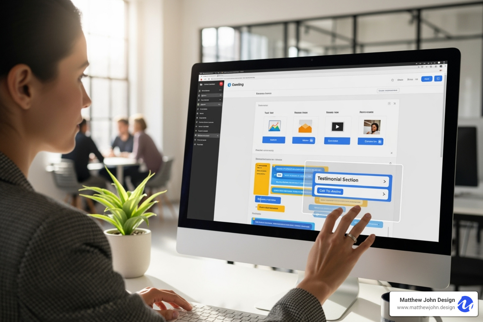
Webflow modular design changes this. Instead of individual pages, you create a smart system of reusable components. It’s like upgrading from single-use gadgets to an adaptable Swiss Army knife.
The benefits are immediate. Scalability is effortless, as your site grows with your business. Brand consistency is automatic with global variables for colors and fonts. Development speed increases dramatically by using pre-tested blocks. Maintenance is simple—update one component, and the change applies everywhere.
The real game-changer is empowering your non-technical teams. Marketing professionals can create compelling landing pages, test sections, and update content without waiting for a developer, breaking a common bottleneck.
The End of Rigid, One-Off Page Designs
Static templates seem safe, but when your business evolves, they become a straightjacket. Every update requires digging through old code. Changing a simple call-to-action button means editing dozens of pages, which guarantees inconsistencies and human error.
Webflow modular design replaces this rigidity with a flexible, dynamic system. Your content blocks become intelligent building materials that adapt to new contexts while maintaining their integrity. This approach future-proofs your website by baking in adaptability. As trends or your brand evolve, the system evolves too, avoiding a complete rebuild.
Empowering Your Team to Move Faster
A well-designed modular system gives your team superpowers. Marketing managers can launch entire campaigns in an afternoon instead of waiting weeks for simple page updates.
Reducing developer dependency frees developers for complex challenges while marketing handles daily content management. It gives everyone the right tools for their job.
Faster campaign launches are the norm when your team can mix and-match pre-built sections. A/B testing becomes a simple component swap. This agility helps your business respond to opportunities quickly, turning your website into an asset that helps you move fast, not an anchor holding you back.
The resulting efficient site management means less time on tedious updates and more on strategy and growth. That's the real power of modular thinking—it makes your entire team more effective.
5 'Wow' Webflow Modular Design Examples
Ready to see Webflow modular design in action? Let's explore five real-world examples that showcase how powerful this approach is. These aren't just pretty designs—they're smart systems that work for your business.
1. The Dynamic "Bento Box" Grid
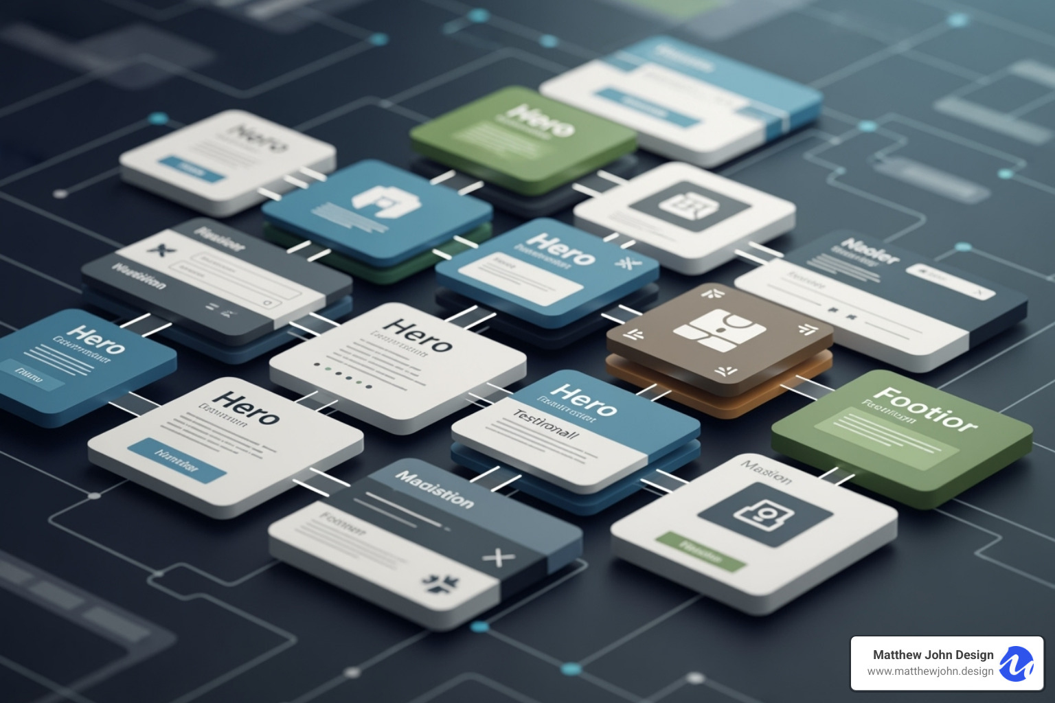
Inspired by Japanese bento boxes, this asymmetrical grid design showcases diverse content—images, videos, text—in a single, visually striking section. Each "bento card" is a self-contained module that follows the same design principles while displaying different content.
Webflow's CSS Grid features make this layout straightforward to build without complex code. You can create precise, responsive grids and easily swap content or rearrange the layout for different pages. We love using bento grids for portfolio websites, agency showcases, and product feature pages.
2. The Mix-and-Match Marketing Section Library
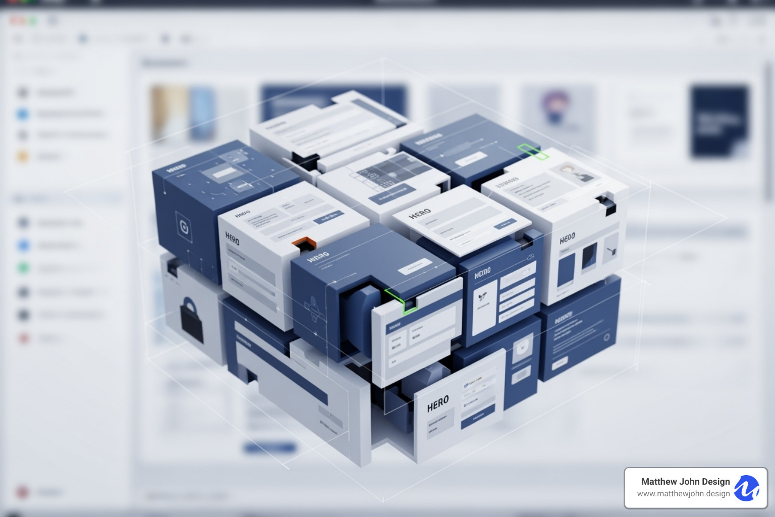
Build a landing page in minutes, not weeks, by creating a library of reusable marketing sections using Webflow Components. Each section—a hero banner, features grid, testimonials carousel, or call-to-action block—becomes a smart module. Your marketing team can drag these pre-designed sections into place, and when you update the main component, every instance across your site updates automatically.
Common sections in a modular library include hero areas, feature showcases, pricing tables, FAQ accordions, and contact forms. With Webflow Components, marketing teams can build pages independently while designers maintain control over brand standards. Learn about Webflow Components to see how this transforms your workflow.
3. The CMS-Powered Resource Hub with Live Filtering
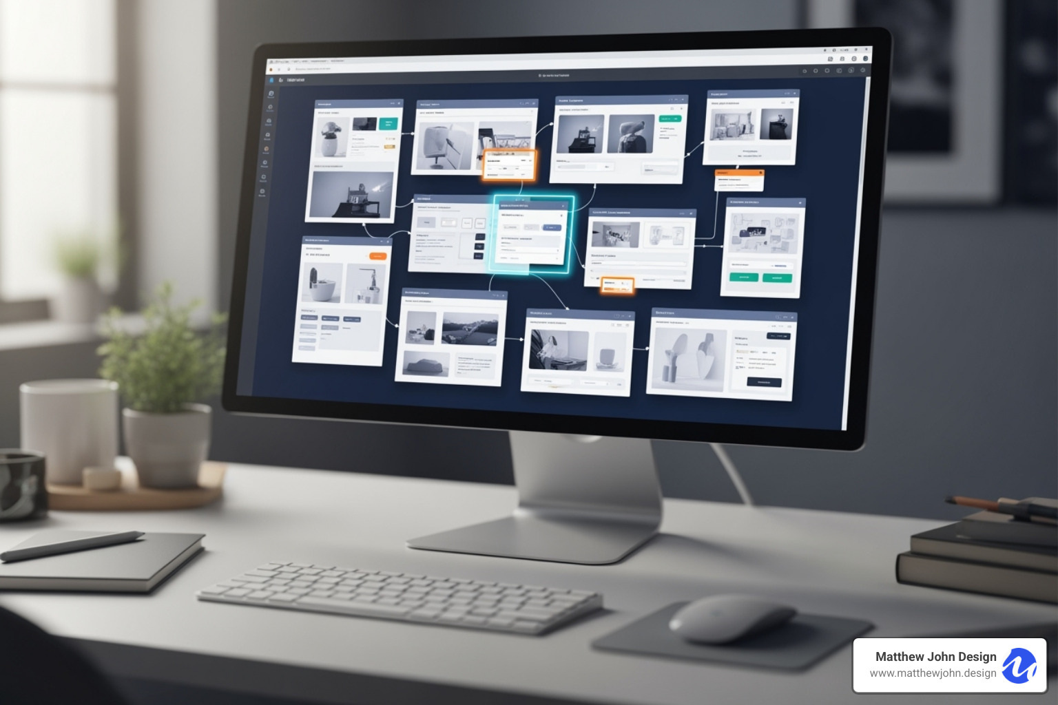
Content-heavy sites like blogs or knowledge bases benefit enormously from Webflow modular design combined with the platform's powerful CMS. Picture a hub where visitors can instantly filter content by category, topic, or tag, with results appearing in real-time.
The modular approach separates content from design. Content lives as a Collection Item in the Webflow CMS, while the display is handled by modular Collection Lists. This means you can redesign how content appears without touching the actual articles. Finsweet Attributes often powers the live filtering, creating interactive experiences without custom code. The result is a scalable content hub that grows with your business. More on the Webflow CMS explains how to leverage these features.
4. The Interactive Product Showcase with Component Slots

Component Slots are one of Webflow's most powerful modular features. Instead of creating separate components for image galleries or video players, you build one flexible component with "slots" that accept different content types. The outer structure stays consistent, but the inner content adapts to each product's needs.
This composability dramatically reduces the number of components you need to maintain. One product might showcase an image gallery, another an embedded demo video from a service like YouTube, Vimeo, or Vidzflow, and a third customer reviews—all using the same underlying component. Webflow Interactions can add tab-switching functionality, letting users move between content types within the same section to create rich, engaging experiences. Webflow Interactions opens up possibilities for these elements.
5. The Scalable E-commerce Product Card System
E-commerce sites must maintain consistency across thousands of products while handling states like sales or new arrivals. A modular product card system solves this. Build one master product card component, then use Component Properties to control specific elements, like toggling a "Sale" badge's visibility.
Webflow Ecommerce integration pulls product data into these cards, while Variables ensure pricing, colors, and spacing remain globally consistent. When you update the main product card, the change applies across your entire catalog instantly. The visibility settings are especially powerful, allowing sale badges or out-of-stock overlays to appear automatically based on product data, with no manual intervention required. This system scales beautifully for any growing e-commerce business.
The Core Toolkit for Your Webflow Modular Design System
Think of building a Webflow modular design system like constructing a well-organized toolshed. You need the right tools, properly labeled and stored in logical places, so anyone on your team can find what they need and use it correctly. Without this foundation, even the most beautiful website becomes a maintenance nightmare.

At its heart, a modular system follows atomic design principles: start with the smallest elements and build up to complete pages. This creates a "single source of truth" where every design rule lives in one place, ensuring site-wide consistency. Webflow's tools are built-in, so you aren't juggling separate design files and code. Everything lives together, helping your marketing team stay on-brand and move fast.
As design system expert Brad Frost notes, the goal isn't just pretty components—it's preventing the design inconsistency that kills websites over time. When your system is embedded in your tools, consistency becomes automatic.
The importance of design systems by Brad Frost
Building with Components and Variables
The foundation of any robust Webflow modular design starts with two core features: Components and Variables.
Webflow Components are your reusable building blocks. When you create a component for a navigation bar or product card, you can use it anywhere. The magic is that when you update the main component, every instance updates automatically. We use components liberally: if an element is used twice, it becomes a component. This discipline creates truly scalable websites and allows for single-click updates across dozens of pages.
Variables (or Design Tokens) are the atomic level of your system. These are global styles for colors, typography, and spacing. Instead of typing a hex code for your brand blue, you create a "Brand Blue" variable and use it everywhere. If your brand evolves, you change the variable once, and it propagates across the entire site. This creates the scalable foundation that makes modular design so powerful.
Achieving Flexibility with Component Slots and Properties
While components offer reusability, Component Slots and Properties provide flexibility to avoid the "everything looks the same" trap.
Component Properties let you customize parts of a component without breaking its connection to the main design. Think of a button with properties for text, the link, or showing/hiding an icon. This is perfect for product cards where the structure is the same, but images and prices differ.
Component Slots take flexibility further. A slot is a placeholder within a component where you can drop in different content. For example, a "Media Card" component could have a slot that you fill with an image, a video, or another component.
Knowing when to use each is key. Use Properties for minor variations (text, color) and Slots for different content types within the same structure. Both maintain design integrity while giving your team creative freedom.
A Naming Convention for a Sane Webflow Modular Design
There's an old programming joke: "There are only two hard problems in Computer Science: cache invalidation and naming things." While funny, it hits at a real truth - poor naming conventions are the silent killer of design systems.
Without a structured approach, you'll end up with a chaotic mess of classes like "blue-button-2" that are impossible to maintain. That's why we swear by the BEM (Block, Element, Modifier) methodology for all our Webflow modular design projects. BEM creates a clear hierarchy:
- Blocks are standalone components like
.cardor.button. - Elements are parts of blocks, like
.card__title. - Modifiers are variations, like
.card--featured.
Good class naming ensures maintainability. A class like .product-card__price--discounted is instantly understandable, preventing the style drift that destroys design systems. Proper naming also enables Webflow's cross-site copy-paste feature. BEM-named components can be copied between projects without style conflicts, creating a true component library. As your system grows, disciplined naming is the difference between a scalable system and one that collapses.
Frequently Asked Questions about Modular Design in Webflow
We often encounter common questions about Webflow modular design. Let's address some of them.
What's the difference between a Webflow template and a modular design system?
This is a crucial distinction.
- A Webflow template is a pre-designed, static starting point. While customizable, templates are fixed layouts. Significant changes or scaling often requires manual workarounds, limiting you to the original structure.
- A modular design system is a flexible framework of reusable building blocks (Components, Variables, Slots) for constructing unlimited pages. It's the difference between a pre-assembled Lego castle (a template) and the entire box of Lego bricks, giving you the freedom to build anything while ensuring all pieces fit together perfectly.
How does modular design improve website SEO?
Webflow modular design offers several significant, indirect SEO benefits:
- Faster Updates for Content Freshness: Modular systems allow for rapid content updates. Search engines favor fresh content, and this efficiency helps keep your site relevant.
- Consistent HTML Structure for Better Crawling: Reusable components create consistent HTML structure, making it easier for search engine bots to crawl and index your site.
- Improved Site Speed from Efficient Code: Modular systems result in cleaner, more efficient code. Faster load times are a direct Google ranking factor and improve user experience.
- Better User Experience Metrics: A cohesive user experience from modular design leads to lower bounce rates and longer time on page—positive signals for search engines.
Can I apply modular principles to an existing Webflow site?
Yes. You can refactor an existing site to be more modular. It's a gradual process, but the long-term benefits of efficiency and scalability are worth it. Here's how:
- Identify Repeating Elements: Audit your site for elements that appear on multiple pages, like navbars, footers, or CTAs.
- Convert to Components: Turn each repeating element into a Webflow Component to centralize its management for site-wide updates.
- Create Global Variables: Convert hard-coded styles (colors, fonts) into Webflow Variables and apply them site-wide to establish your design tokens.
- Standardize Classes: Adopt a consistent naming convention like BEM and rename classes as you refactor.
- Refactor Sections: Break down pages into smaller, reusable sections. Consolidate similar sections (e.g., "Features" sections) into a single, configurable Component.
By gradually converting your site, you'll gain efficiency and maintainability, turning it into a powerful, scalable asset.
Conclusion: Build Better, Not Just Bigger
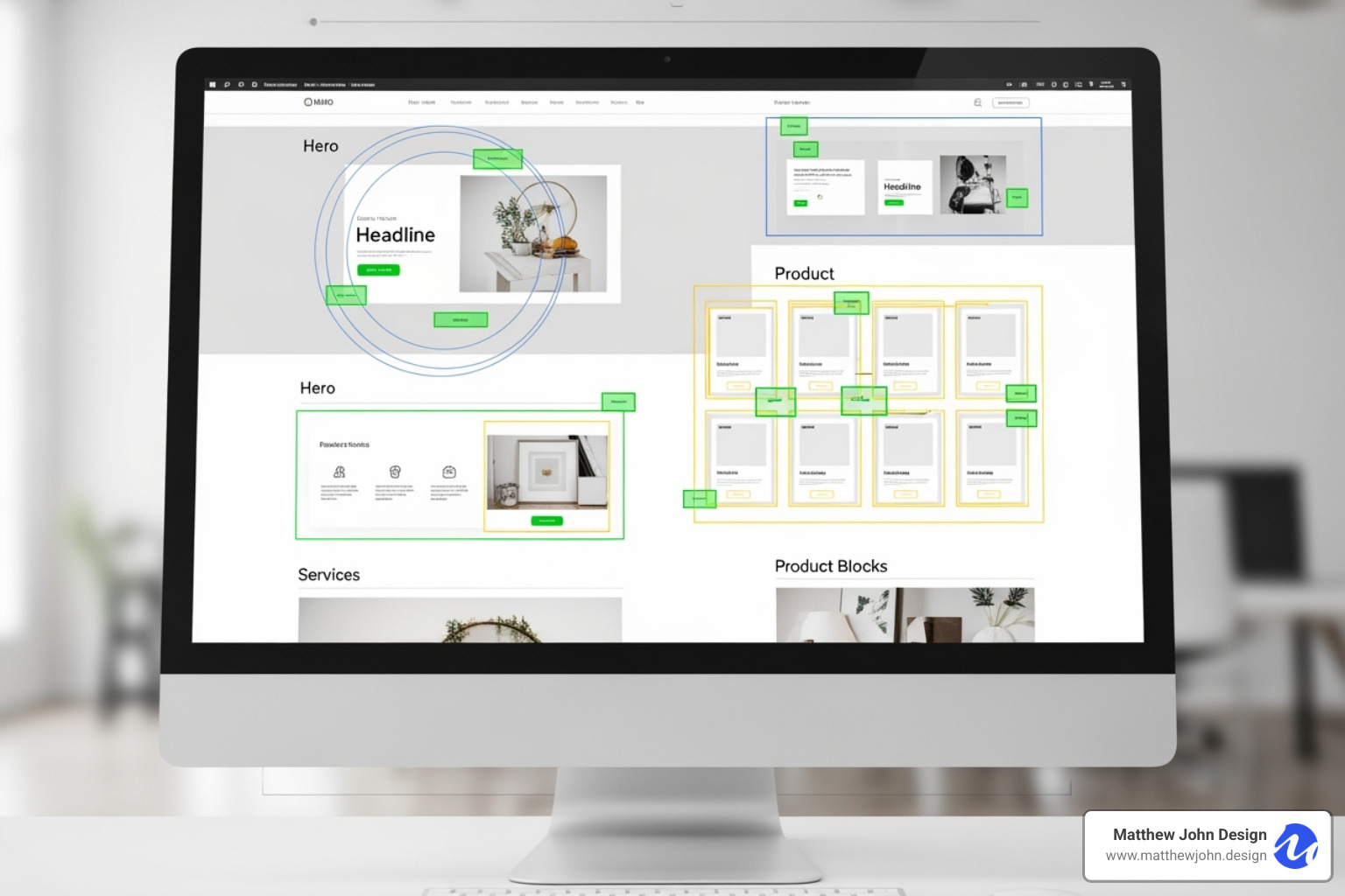
Traditional design is like building a house from scratch every time. Modular design is like having a sophisticated building system with high-quality, tested components to create anything you need.
The benefits are clear: scalability that grows with your business, perfect brand consistency, and dramatically increased development speed. Most importantly, it empowers marketing teams by removing developer bottlenecks.
This composable approach is the future of web design. It creates flexible systems where innovation comes from recombination, not starting from scratch. Your website becomes a living platform that adapts to market changes and scales with your business.
Modularity is about more than efficiency; it's about creating evolvable digital experiences. Your team can launch campaigns without scrambling, brand updates are instant and site-wide, and new team members can contribute from day one thanks to an intuitive system.
For businesses ready to implement a truly scalable system, Matthew John Design specializes in creating advanced Webflow modular design frameworks. We build component-based systems that improve website interactivity and enable efficient management, allowing your team to innovate without bottlenecks.
The choice is clear: you can continue building bigger, adding more pages and complexity to an already unwieldy system. Or you can build better—creating a foundation that makes every future project easier, faster, and more effective. The modular approach is an investment in your team's ability to move at the speed of modern business.
