Any information contained on this Website is not legal advice and should not be treated as such. You should always contact an attorney for help with your specific legal needs and issues. We may also earn a commission when you click links to our partners and purchase goods or services. For more information, read our Disclaimers Policy.
Bringing Your Data to Life
How to design interactive graphs for website success starts with understanding that static charts simply don't cut it anymore. Your website visitors want to explore, filter, and interact with your data - not just look at it.
Here's the quick answer for creating interactive website graphs:
- Choose your tool: JavaScript libraries (D3.js, Chart.js) for full control or no-code platforms (Infogram, Datawrapper) for speed
- Select the right chart type: Line charts for trends, bar charts for comparisons, scatter plots for correlations
- Add interactivity: Tooltips, hover effects, filtering, and zoom functionality
- Optimize for performance: Use lazy loading and handle large datasets efficiently
- Ensure accessibility: Include ARIA labels and keyboard navigation
Interactive graphs transform boring spreadsheet data into compelling visual stories. They boost user engagement by up to 25% compared to static charts, according to research from interactive content platforms. When visitors can click, hover, and explore your data, they stay longer and understand your message better.
The business impact is clear. Interactive visualizations help you simplify complex information, increase brand awareness through shareable content, and create memorable experiences that turn visitors into customers.
But here's the challenge: most business owners think interactive graphs require a team of developers and months of coding. That's not true anymore. Modern tools make it possible to create professional interactive visualizations in hours, not months.
, 2. Select appropriate chart type based on data (line, bar, scatter, network), 3. Design user interactions (tooltips, filtering, zoom), 4. Implement responsive design for mobile, 5. Test performance and accessibility - how to design interactive graphs for website infographic")
How to design interactive graphs for website terms to learn:
Choosing the Right Interactive Graph for Your Data
Think of choosing the right graph type like picking the perfect tool for a job. You wouldn't use a hammer to fix a watch, and you shouldn't use a pie chart to show trends over time. How to design interactive graphs for website success starts with understanding what story your data wants to tell.

Before diving into fancy animations or complex features, step back and ask yourself: What relationships do you want to highlight? Are you showing data relationships between different elements, tracking changes over time with time-series data, making categorical comparisons, displaying hierarchical data structures, or presenting geospatial data on maps?
The wrong chart type can actually make your data harder to understand. I've seen beautiful interactive dashboards that completely missed the mark because they used scatter plots for simple comparisons or pie charts for time trends. Your visitors shouldn't have to work to understand your message.
For inspiration on creating engaging visual experiences that tell compelling stories, explore our guide on creative interactive web design.
Here are the most effective interactive graph types and when to use them:
- Line Charts: Perfect for time-series analysis and trend identification
- Bar Charts: Ideal for category comparison and ranking data
- Scatter Plots: Best for correlation analysis and identifying outliers
- Bubble Charts: Great for three-dimensional data visualization
- Heatmaps: Excellent for showing data density and patterns
- Network Graphs: Perfect for relationship visualization and connection strength
- Maps: Essential for geographic data and location-based insights
Line and Area Charts
When your data changes over time, line and area charts become your best friends. They excel at time-series analysis and trend identification, making patterns jump off the screen. Whether you're tracking website visits, sales performance, or customer growth, these charts handle continuous data beautifully.
The real magic happens when you add interactivity. Users can zoom into specific time periods, hover for exact values, or toggle between different datasets for multiple datasets comparison. Imagine showing your company's growth over five years - visitors can focus on that crucial quarter when everything changed, or compare different product lines side by side.
Bar and Column Charts
For category comparison and ranking data, nothing beats the clarity of bar and column charts. They handle discrete data points perfectly and can even display negative values without confusion. Think product sales by region, survey responses by age group, or budget allocations across departments.
Interactive bar charts let users sort categories on the fly, filter by specific criteria, or drill down into subcategories. This transforms static comparisons into engaging explorations where visitors find insights themselves.
Scatter and Bubble Plots
These charts are your go-to tools for correlation analysis and identifying outliers in your data. Scatter plots reveal relationships between two variables that might be invisible in spreadsheets. Add a third dimension with bubble size, and you've got three-dimensional data visualization that tells richer stories.
Interactive features like hover tooltips and brushing selections turn data exploration into an intuitive experience. For detailed guidance on perfecting these visualizations, check out this resource on Getting the Details Right in an Interactive Line Graph.
Maps and Network Graphs
When your data has a location component, interactive maps bring geographic data to life with powerful location-based insights. Users can zoom, pan, and click regions for detailed information, changing static geography into dynamic storytelling.
Network graphs excel at relationship visualization, showing how different elements connect and the connection strength between them. Whether it's organizational structures, social networks, or supply chains, these visualizations help users understand complex systems through interactive exploration.
Core Principles for Designing Effective Interactive Graphs
Think of designing interactive graphs like hosting a dinner party. You want your guests (users) to feel welcome, find everything they need easily, and leave with a memorable experience. How to design interactive graphs for website success follows the same principle - it's all about creating meaningful connections between your audience and your data.

The secret sauce lies in balancing user experience (UX), data clarity, and performance optimization. A poorly designed interactive graph is like serving a five-course meal on paper plates - the content might be great, but the presentation ruins everything.
One crucial concept that guides all good data visualization is the data-to-ink ratio. This principle means showing more data with less visual clutter. Every line, color, and element should serve a purpose. If it doesn't help tell your data's story, it's just noise.
Focus on User Interaction
The magic happens when users can actually explore your data, not just stare at it. Great interactive graphs feel like having a conversation with your data - natural, intuitive, and revealing.
Intuitive controls are your foundation. Users shouldn't need a manual to figure out how to filter, sort, or zoom. Think of how naturally people pinch to zoom on their phones - that's the level of obviousness we're aiming for.
Hover effects and tooltips are your best friends for providing detailed information without overwhelming the main view. When someone hovers over a data point, they should instantly see the exact values and context they need. It's like having a knowledgeable tour guide who appears exactly when you need them.
Zooming and panning capabilities transform dense datasets from confusing walls of numbers into explorable territories. This is especially powerful for time-series data or large scatter plots where users need to focus on specific areas to uncover insights.
Data filtering and selection tools empower users to see exactly what matters to them. Whether it's checkboxes to toggle data series, sliders for date ranges, or brushing to select specific areas, these controls turn passive viewers into active explorers.
Clickable legends should work like light switches - click to turn data series on or off. This transforms your legend from a static label into an interactive control panel that puts users in charge of their viewing experience.
Ensure Performance and Accessibility
Even the most beautiful interactive graph becomes useless if it's slow or excludes users. Performance and accessibility aren't technical afterthoughts - they're fundamental to successful data storytelling.
Handling large datasets requires smart strategies. When you're dealing with millions of data points, techniques like data decimation, lazy loading, and asynchronous rendering keep your graphs smooth and responsive. Chart.js, for example, can handle up to 1 million points using its decimation plugin without breaking a sweat.
Performance optimization extends beyond just data handling. Optimizing your JavaScript bundle size and using techniques like tree-shaking ensures fast page load times that keep your audience engaged instead of waiting.
Accessibility means everyone can understand and interact with your data. This includes proper ARIA labels for screen readers, full keyboard navigation support, and text alternatives that describe your visual data. Just like we ensure our Webflow components work for all users, our graphs must be inclusive by design. For detailed guidance, check out How to make interactive charts accessible.
Tell a Compelling Story
Raw data is like ingredients in a pantry - it has potential, but it needs a skilled chef to turn it into something meaningful. Interactive graphs are your kitchen for changing numbers into narratives that resonate with your audience.
Visual hierarchy guides your user's attention to what matters most. Use color, size, and contrast strategically to highlight key data points or trends. Think of it as directing a movie - you're controlling where the audience looks first, second, and third.
Annotations and highlighting provide the "why" behind your numbers. Don't just show that sales spiked in March - add an annotation explaining it was due to your new product launch. Context turns data points into insights.
Guiding the user's eye through thoughtful animation and transitions creates a smooth, engaging experience. When data changes or new information appears, smooth transitions feel natural and help users follow the story. Jarring, sudden changes break the narrative flow.
The goal is creating an experience where users don't just see your data - they understand it, remember it, and act on it. This approach to data storytelling is a cornerstone of Creative Interactive Web Design.
How to Design Interactive Graphs for a Website: Tools and Implementation
Now for the exciting part! When it comes to how to design interactive graphs for website success, you have two main paths ahead of you. Think of it like choosing between a fully custom suit and a well-fitting off-the-rack option. JavaScript libraries give you that bespoke experience with complete control over every detail, while no-code tools get you looking sharp fast. Your choice depends on your technical comfort level, timeline, and how much customization you need.
The beauty of interactive graphs lies in their flexibility. Whether you're showcasing quarterly sales data or mapping complex user journeys, the right implementation approach can make all the difference. For broader inspiration on interactive elements across your entire site, check out our Interactive Website Design Examples.
Using JavaScript Libraries for Full Customization
If you want your interactive graphs to match your brand perfectly and behave exactly how you envision, JavaScript libraries are your best friend. Yes, there's a learning curve, but the creative freedom is incredible. You're not limited by templates or preset color schemes - everything can be custom to your exact specifications.
D3.js is the heavyweight champion of data visualization. It's like having a Swiss Army knife for charts - incredibly versatile but requiring some skill to master. You can create everything from simple bar charts to mind-bending network visualizations that would make your data science team weep with joy. The interactive possibilities are endless, from smooth brushing and zooming to custom animations that guide users through your data story. For deep customization insights, explore Customizing d3.js chart | the D3 Graph Gallery.
Chart.js strikes a perfect balance between power and simplicity. It's the friendly neighbor who's always willing to help - reliable, straightforward, and surprisingly capable. With support for eight different chart types and the ability to handle up to a million data points (thanks to its decimation plugin), it's become a developer favorite. The responsive design features mean your charts will look great on everything from smartphones to ultrawide monitors.
Plotly.js brings scientific-grade visualization to the web. If your data needs 3D representations or complex statistical charts, Plotly.js delivers with built-in interactivity that would take hours to code from scratch. Google Charts offers the reliability you'd expect from Google, with a wide variety of chart types and seamless integration. Highcharts rounds out the options with enterprise-level features and the kind of polish that Fortune 500 companies trust.
The trade-off? You'll need some coding knowledge to implement these libraries effectively. But once you're comfortable with HTML, CSS, and JavaScript, the creative possibilities are limitless.
A Step-by-Step Guide on How to Design Interactive Graphs for a Website
Let's walk through creating an interactive graph step by step. Don't worry - it's more straightforward than you might think.
1. Set up your HTML foundation. Reserve a spot on your webpage:
<div id="myInteractiveChart" style="width:100%; height:400px;"></div>2. Include your chosen library. Invite the chart-making tools to your party. For Chart.js, add:
<script src="https://cdn.jsdelivr.net/npm/chart.js"></script>3. Prepare your data. Your data needs to be in a format the library understands:
const myData = { labels: ['Jan', 'Feb', 'Mar', 'Apr', 'May'], datasets: [{ label: 'Sales', data: [100, 120, 150, 130, 180], borderColor: 'rgb(75, 192, 192)', tension: 0.1 }]};4. Configure the chart. Define your chart type, pass in the data, and set up interactive features:
const ctx = document.getElementById('myInteractiveChart').getContext('2d');new Chart(ctx, { type: 'line', data: myData, options: { responsive: true, plugins: { tooltip: { callbacks: { label: function(context) { return context.dataset.label + ': ' + context.parsed.y + ' units'; } } } }, scales: { y: { beginAtZero: true } } }});5. Style and refine. Use the options object to set brand colors, hover effects, and tooltip behavior, then watch your chart come to life.
Using No-Code Tools for Quick Implementation
Sometimes you need results yesterday, and that's where no-code tools shine. These platforms understand that not everyone wants to wrestle with JavaScript - sometimes you just want to upload your data, make it look good, and get on with your day.
Datawrapper is a go-to choice for journalists and content creators who need clean, professional visualizations fast. Upload your data, choose a chart type, customize the appearance, and grab the embed code. The results are responsive and accessible right out of the box.
Infogram takes things up a notch with its AI chart generator that can create stunning interactive visualizations in minutes rather than hours. The drag-and-drop interface feels intuitive, and the dynamic effects - like data point animations and scroll-activated reveals - add that extra layer of engagement that keeps users exploring your data.
Canva's graph maker brings the same design-friendly approach that made them famous for social media graphics to data visualization. With professionally designed templates and seamless data integration through Canva Sheets, it's perfect for teams who want beautiful charts without the technical complexity.
Graphy positions itself as the tool that "just works" for data storytelling. Used by more than 100,000 teams, it focuses on making insights clear and compelling through visual annotations and intuitive design improvements.
The beauty of no-code tools lies in their speed and simplicity. You can have a professional interactive graph embedded on your site in under ten minutes. The limitation is customization - you're working within the design boundaries set by the platform. But for many businesses, these tools provide more than enough flexibility to create engaging, effective data visualizations.
When using a platform like Webflow, integrating these embeds is incredibly straightforward. It's possible to create an easy-to-use drag-and-drop system with Webflow components and page building, allowing marketing teams to add and manage interactive elements without touching a single line of code. It's the perfect blend of professional design and user-friendly management. Learn more about this approach in our guide to Webflow Interactive Websites.
Frequently Asked Questions about Interactive Graph Design
Let's be honest - implementing interactive graphs can feel overwhelming at first. We get asked about the same concerns over and over again, so let's tackle the big questions that keep people up at night when they're planning their how to design interactive graphs for website strategy.
How do I make my interactive graph mobile-friendly?
Here's the reality: if your interactive graph doesn't work on mobile, you've lost half your audience before they even see your data. Mobile traffic dominates the web, and your graphs need to shine on those smaller screens.
Responsive design is your foundation. Most modern JavaScript charting libraries like Chart.js automatically adapt to screen size, which means they'll redraw themselves to fit perfectly. If you're building custom visualizations with D3.js, you'll need to implement responsive SVG techniques - it's more work, but totally worth it.
Touch-friendly controls are crucial. Those hover effects that work beautifully on desktop? They're useless on mobile. Replace them with tap-based interactions for tooltips and data selection. Make sure any buttons or sliders are big enough for fingers, not just mouse cursors.
Adapting layouts for small screens often means simplifying what users see initially. Maybe you show fewer data series by default, or offer a streamlined view that expands when needed. The key is giving users the essential information first, then letting them dig deeper if they want.
Simplifying interactions on mobile is smart design, not compromise. Complex multi-axis zooming might be perfect on desktop but frustrating on a phone. Focus on the interactions that matter most and make them work flawlessly.
What's the biggest mistake to avoid when designing interactive charts?
The biggest mistake we see? Over-complication and clutter. It's like trying to tell someone your entire life story in the first five minutes of meeting them.
When you cram every piece of data and every possible interaction into one graph, you create chaos. Users get overwhelmed, confused, and frustrated. They'll leave your site instead of exploring your carefully crafted visualization.
Misleading visualizations happen when there's too much noise. Your audience can't see the forest for the trees, and they might draw completely wrong conclusions from your data.
Poor performance is another killer. Heavy, complex graphs that take forever to load will hurt your website's speed and user experience. Google notices this stuff, and so do your visitors.
Hiding important data behind interactions defeats the purpose. If users need to click through five different menus to find your key insight, you've buried your treasure too deep.
Start simple. Focus on your core story. Add interactivity strategically to improve understanding, not to show off every cool feature you found in the documentation.
Can interactive graphs hurt my website's SEO?
This is a smart question, and the answer is: potentially yes, but only if you implement them poorly. Done right, interactive graphs actually boost your SEO by improving user engagement.
Page load speed is the main concern. Interactive graphs can slow down your site, especially if you're loading massive JavaScript libraries or huge datasets. Google's Core Web Vitals directly impact your search rankings, so this matters.
We solve this with lazy loading (loading data only when needed), minifying JavaScript files, and using CDNs for faster library delivery. Chart.js's tree-shaking feature lets you include only the components you actually use, dramatically reducing file size.
Large JavaScript files can hurt your site's performance. The solution is optimization - only load what you need, when you need it.
Accessibility impact is often overlooked but crucial. Search engine crawlers need to understand your data, and screen readers need to access it too. We always include text summaries for crawlers, proper ARIA labels, and clear descriptions of what the data shows.
The beautiful thing is that well-designed interactive graphs actually improve your SEO. They increase time on page, reduce bounce rates, and create the kind of engaging content that people want to share. Users stay longer, explore more, and remember your site.
The key is balancing visual appeal with technical performance. When you get that balance right, your interactive graphs become SEO assets, not liabilities.
Conclusion: Tell Your Data's Story
Your journey through how to design interactive graphs for website success doesn't end here - it's just beginning. Think of this as your roadmap to changing those boring spreadsheets into visual stories that actually captivate your audience.
The path forward is clearer than you might think. Start with your data's story - what message are you trying to convey? A line chart for showing growth trends, scatter plots for revealing correlations, or network graphs for mapping relationships. The chart type should serve the story, not the other way around.
Focus on user experience above everything else. Your visitors want to explore, not struggle. Intuitive controls, smooth hover effects, and clear tooltips make the difference between a graph that engages and one that frustrates. If someone can't figure out how to interact with your visualization in seconds, they'll move on.
The tools are more accessible than ever. JavaScript libraries like D3.js and Chart.js give you complete creative control, while no-code platforms let you create professional visualizations in minutes. Choose based on your timeline and customization needs, not what seems most impressive.
Never compromise on performance and accessibility. A beautiful graph that takes forever to load or can't be steerd with a keyboard isn't serving anyone well. These aren't afterthoughts - they're the foundation that everything else builds on.
Interactive graphs do more than display data - they create experiences. When done right, they boost engagement, simplify complex information, and turn casual visitors into invested stakeholders in your story. They're powerful tools for data storytelling that can genuinely transform how people understand and connect with your message.
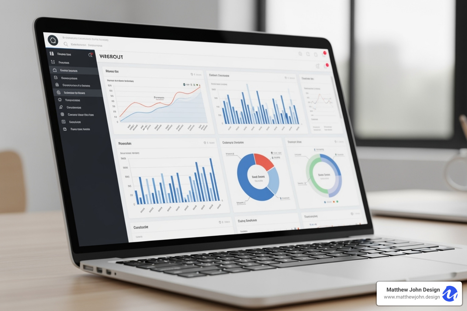
At Matthew John Design, we've seen how the right interactive elements can transform a website from functional to exceptional. We specialize in building Webflow sites with scalable component-based systems that your marketing teams can actually use and update. No more waiting weeks for developer changes - just smooth, interactive experiences that work beautifully and perform flawlessly.
Ready to turn your data into compelling visual narratives that drive real business results? Let's create something remarkable together.
