Any information contained on this Website is not legal advice and should not be treated as such. You should always contact an attorney for help with your specific legal needs and issues. We may also earn a commission when you click links to our partners and purchase goods or services. For more information, read our Disclaimers Policy.
The Power of Modular Design in Webflow
Webflow custom components are reusable design blocks you create once and use throughout your website. They are the foundation of efficient, scalable web design, saving time and ensuring consistency.
Quick Overview: What Are Webflow Custom Components?
- Reusable elements: Create buttons, cards, or entire sections once and use them everywhere.
- Global updates: Change the main component, and all instances update automatically.
- Flexible content: Use props and slots to customize content for each instance.
- Style variants: Create multiple design options, like light/dark themes, for one component.
- Team efficiency: Allow marketing teams to manage content without breaking designs.
Think of components as a design system for your website. Instead of rebuilding a button on every page, you create it once as a component. Your team can then add it anywhere and customize the content without touching the design. This approach eliminates hunting through pages to update a single style and prevents inconsistent designs when new pages are created.
When you edit the main component, every instance across your site updates automatically. For growing businesses, this means faster updates, fewer inconsistencies, and marketing teams who can work independently without breaking your carefully crafted designs.
Webflow custom components terms made easy:
Getting Started with Webflow Custom Components
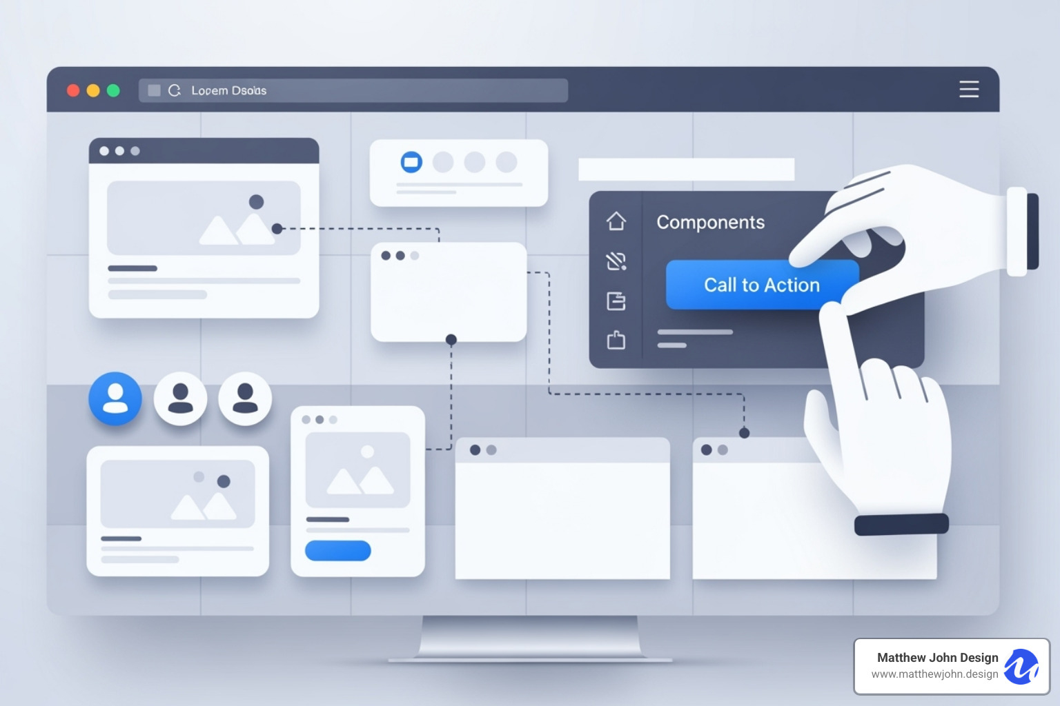
Webflow custom components are your design system's building blocks. A component is any element or group of elements packaged for reuse, like a button with brand colors or a card layout for blog posts. Instead of rebuilding elements, you drag instances from the Components panel onto any page. Each instance is linked to the main component, so when you update the original, every copy across your site updates automatically. This allows your marketing team to focus on content while you maintain design consistency.
For a comprehensive foundation, see A guide to Webflow Components from Webflow University. To see how components fit into a broader strategy, check out our guide on How to Build Excellent Webflow Websites.
The Simple Process of Creating Your First Component
The process is straightforward. Start by selecting the element or group of elements you want to reuse, such as a div block for a testimonial or a styled button. Next, click the create component icon in your toolbar. Webflow will prompt you to name your new component.
Naming conventions are crucial. Use descriptive names like "Button Primary Blue" instead of "Button 1" so your team can easily identify them later. Once saved, your new component appears in the Components panel, ready to be dragged and dropped. Each instance stays connected to the main component, ensuring design updates are global while content can be customized.
The Components overview from Webflow Help provides excellent visual guidance for these fundamentals.
Editing and Managing Your Components
The power of Webflow custom components is most apparent when making changes. To edit the main component, double-click any instance on your canvas or right-click and select "Edit component." Any changes you make will update globally across all instances. Change the padding on a button, and every button updates instantly.
If you need one instance to be different, unlinking is the solution. Right-click an instance and choose "Unlink instance" to sever its connection to the main component. This converts it back into regular elements you can modify independently, but it will no longer receive global updates.
As your library grows, component organization is key. Group related components in the Components panel (e.g., navigation, content blocks, forms). To delete a component, first remove or unlink all its instances, then delete the main component from the panel. This systematic approach keeps projects organized and teams productive.
Advanced Customization: Props, Slots, and Variants
To lift your Webflow custom components, you need to master advanced features. These transform simple reusable elements into dynamic, flexible components that adapt to any situation while maintaining consistency. Component Properties (Props), Slots, and Style Variants make this possible.
- Props let you customize the content of each instance—like text, images, and links—without breaking the connection to the main component.
- Slots allow you to nest other components inside existing ones, creating flexible layouts.
- Style Variants give you multiple design options for the same component, such as a button that can be solid, outlined, or ghost-style.
These features allow you to create fewer, smarter components that handle multiple scenarios. Your marketing team gets the flexibility they need, while you maintain design consistency. For teams building dynamic experiences, these features are essential. See how this translates into engaging user experiences in our article on Webflow Interactive Websites.

Using Component Properties (Props) for Dynamic Content
Component Properties, or Props, solve a key challenge: keeping styling consistent while allowing unique content per instance. Props let you define which parts of a component are customizable. The heading text, hero image, or button link can differ on each instance, while the core styling remains locked.
Defining props is simple. In the main component's edit mode, select an element you want to make customizable, like a heading. In the settings panel, create a prop and give it a clear name like "Card Title." This becomes a customizable field for every instance. You can connect props to text, images, and even integrate with the CMS. By linking component props to Collection fields, your blog post cards can automatically pull in titles, images, and summaries.
This approach enables customizing instances without unlinking. Each instance can have unique content while remaining connected for global design updates. For developers, More on custom HTML attributes provides technical background.
Leveraging Style Variants for Design Flexibility
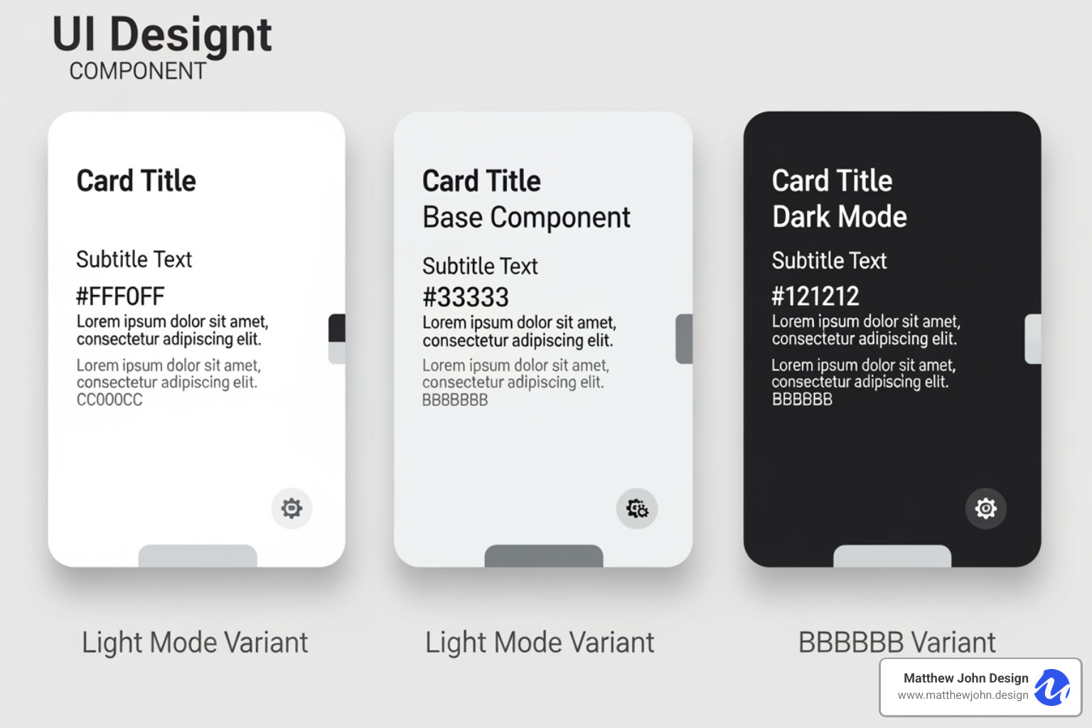
Style Variants make Webflow custom components incredibly versatile. Instead of creating separate components for every design variation, you build multiple style options within a single component.
Creating variants happens in the main component's edit mode. Use the component variants icon in the Style panel to add a new variant, name it (e.g., "Dark Mode"), and customize its styling. Changes only apply to that specific variant.
Applying variants to instances is easy. Select an instance, and choose the desired style from the Variants dropdown in the settings panel. The instance transforms while keeping its custom content from props.
Common use cases include:
- Buttons: Create "Primary," "Secondary," and "Ghost" styles, or different sizes like "Small" and "Large."
- Cards: Add a "Featured" variant with a colored border, a "Compact" variant for sidebars, or a "Horizontal" layout.
- Sections: A hero section could have variants for different text alignments or background treatments, allowing one component to serve multiple pages.
This approach keeps your component library lean while providing maximum flexibility and consistency.
Best Practices for a Scalable Component-Based Workflow
Using Webflow custom components is about creating a system that grows with your business. A well-organized component system allows teams to manage websites independently without breaking the design. The goal is to create a system so intuitive that your marketing team can add new pages or update sections without design support.
At Matthew John Design, we specialize in building these scalable systems for internal marketing teams. A well-organized component system can transform businesses globally, from startups to established companies.
Every successful library includes essentials like Sliders, Tables, Cookie Consent banners, Marquees, Number Count animations, Navbars, Footers, Forms, FAQ sections, and versatile Card components. For more on our approach, explore Matthew John Design's Webflow Component Resources.
Organizing and Naming Your Webflow Custom Components
Proper naming is critical for long-term maintainability. Instead of "Button," use descriptive names like "Button - Primary" or "Card - Product." This creates a system that makes sense to anyone on your project.
Grouping related components is equally important. Webflow lets you create folders in the Components panel for "Buttons," "Cards," "Navigation," etc. This hierarchical structure turns a potential mess into a clean, navigable system. When components are well-named and organized, your marketing team becomes independent, able to use the right elements while maintaining brand consistency. This creates an agile website that serves business goals without constant maintenance overhead.
Reusing Components Across Projects with Libraries
Libraries are a Webflow feature that provides a true competitive advantage for agencies and businesses managing multiple sites. They turn your component system into a centralized design powerhouse. Instead of rebuilding a navigation bar for each new project, you save it to a shared Library and reuse it everywhere.
When a brand color or logo changes, you update it once in the Library, and it propagates to every connected site automatically. This eliminates repetitive updates across dozens of projects. For agencies like Matthew John Design, this dramatically cuts development time and ensures quality.
Brand consistency becomes effortless when your digital ecosystem pulls from the same library. This feature requires a Webflow Workspace plan and is a core part of our Website Management services, ensuring sites stay consistent and up-to-date.
Extending Functionality with Custom Code and Attributes
While Webflow's visual builder is powerful, sometimes Webflow custom components need extra functionality. For custom animations, unique interactions, or third-party integrations, custom code and attributes are the solution. You can add HTML for structure, CSS for styling, and JavaScript for interactivity using the Embed element or in project/page settings.
We explore creative applications in our article on Creative Interactive Web Design.

Enhancing your Webflow custom components with attributes
Custom attributes attach specific information or behaviors to any HTML element, which can then be used by scripts.
- Custom data-attributes: These attributes, which start with
data-, store information for your scripts. For example,data-animation-type="fade"could trigger a specific animation. - Accessibility through ARIA attributes: ARIA attributes like
aria-labelhelp screen readers understand interactive elements, which is essential for creating accessible websites. - Third-party script integration: Many JavaScript libraries look for specific
data-attributes to function. Adding these to your components allows you to integrate advanced features like custom animations or dynamic filtering.
Most custom code only works on your published website, not in the Webflow Designer. Always publish and test thoroughly. For more, see our insights on Advanced functionality with custom attributes.
Create an Easy-to-Use Drag-and-Drop System with Webflow Components and Page Building
This involves creating a front-end drag-and-drop system that lets content editors rearrange content on the published website, not the Webflow Designer. Imagine your marketing team visually reordering landing page sections without design help.
Integrating JavaScript libraries like Sortable.js makes this possible by turning elements on your published site into draggable components. Your Webflow custom components serve as the building blocks, ensuring design integrity is maintained even as layouts change.
Empowering content editors is the goal. They can create dynamic page layouts by dragging pre-designed component blocks, reordering them, and filling them with content using component properties. This reduces reliance on designers for routine updates and creates an intuitive page-building experience. Learn more in our guide to Webflow Drag and Drop Components.
Frequently Asked Questions about Webflow Components
Here are answers to common questions about Webflow custom components.
Can I share components between different Webflow projects?
Yes, using the Libraries feature, which requires a Webflow Workspace plan. Libraries allow you to create a central repository of components that can be used across any site within that workspace. This is a game-changer for brand consistency. When you update a component in the Library, the change automatically applies to every site using it. This saves significant development time for agencies and businesses managing multiple properties.
What's the difference between a component and a symbol?
Components are the evolved, more powerful version of what Webflow previously called "Symbols." While the core idea of reusability is the same, Components introduced advanced features that Symbols lacked, such as properties (props) for customizing content, slots for nesting other components, and style variants for multiple design options. In short, Components offer far more flexibility for creating dynamic elements.
What are the limitations of using components?
While powerful, components have a few limitations to consider:
- Performance: Overly complex components with deep nesting can potentially slow down site load times. Keep components focused and purposeful.
- Custom Code Execution: JavaScript placed within a component only executes on the published website, not in the Webflow Designer. You must publish your site to test custom functionality.
- Video Hosting: Webflow's native video support is limited to background videos up to 30 MB. It does not provide hosting for larger video files, so for these, you must use third-party solutions like YouTube, Vimeo, or Vidzflow and embed them into your components.
Conclusion: Build Scalable, Manageable Websites with Components
Webflow custom components are your secret weapon for building websites that work for your business. By mastering components, you can transform chaotic websites into clean, modular systems. We've covered how to create basic components, use advanced features like props and variants, and apply best practices for a scalable workflow.
The result is a system where your marketing team can update content without breaking designs, global changes happen with a single edit, and new pages are built faster. This efficiency translates directly into business results: quicker responses to market opportunities, stronger brand recognition, and reduced bottlenecks.
At Matthew John Design, we specialize in building Webflow custom component systems that empower internal marketing teams worldwide. This results in websites that are powerful, scalable assets.
A component-based approach is about creating digital platforms that scale with your ambitions. Whether you're launching new products or expanding to new markets, a well-structured component system makes it all smoother.
Ready to build a website that truly works for your business? Start building a scalable website with our Web Design and Build services and find what happens when your website becomes your most efficient team member.

